 EN
EN
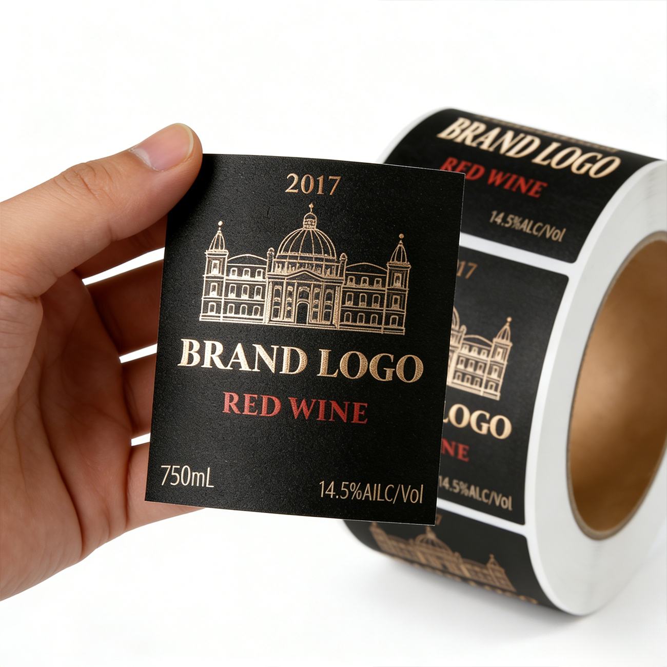
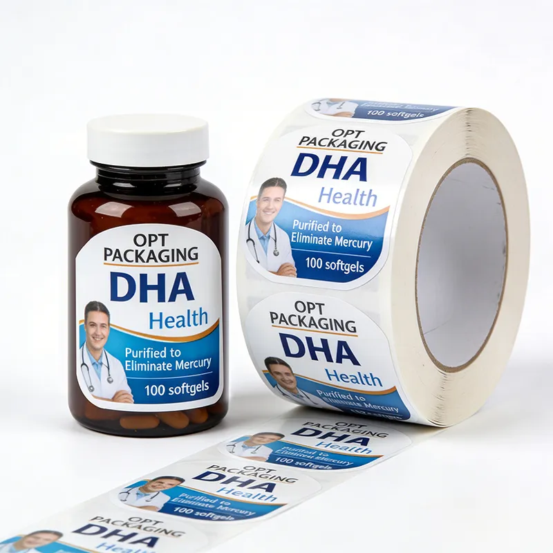
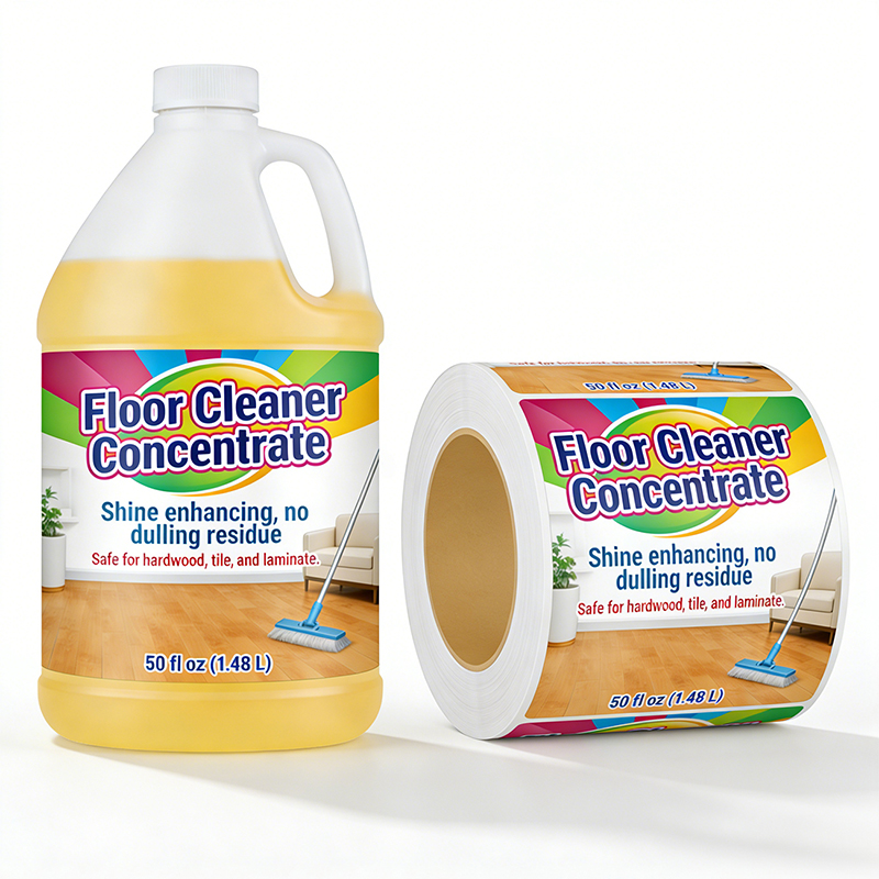
A bottle label serves as the silent salesman of any product on retail shelves, often determining whether a consumer picks up your item or passes it by. In the competitive landscape of food and beverage retail, the visual impact of a bottle label can mean the difference between strong sales performance and shelf obscurity. The bottle label is not merely a legal requirement for ingredient listing and branding; it is a strategic marketing tool that communicates brand identity, product quality, and consumer value in mere seconds. Understanding how a bottle label enhances product appeal requires insight into consumer psychology, design principles, and retail dynamics that influence purchasing decisions at the point of sale.
The retail shelf environment is inherently crowded, with dozens of competing products vying for attention. A well-designed bottle label cuts through this visual noise by establishing immediate brand recognition and emotional connection. The bottle label communicates core product benefits, quality signals, and differentiation within milliseconds, which is the actual timeframe consumers use to evaluate products during shopping. Strategic bottle label design incorporates color psychology, typography, imagery, and spatial hierarchy to guide consumer eyes and influence perception of product value and authenticity.
Visual Impact and Consumer Attention
Color Strategy in Bottle Label Design
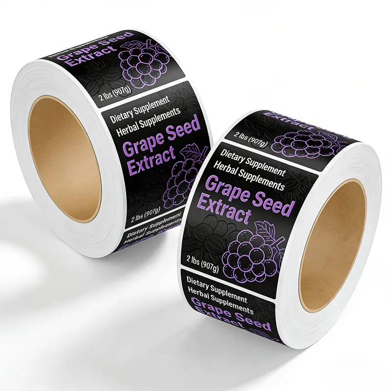
Color is the most powerful element of a bottle label because it triggers emotional responses and category recognition before consumers even read text. A bottle label using bold, contrasting colors stands out against competing products and creates immediate visual hierarchy on crowded shelves. Different product categories have established color associations—premium honey products often use warm gold and amber tones on their bottle label, while organic products typically employ green, brown, or natural earth tones. The choice of color in your bottle label must balance category conventions with brand differentiation to achieve both recognition and shelf visibility.
Typography and Readability
The typeface and font sizing choices on a bottle label directly impact whether consumers can quickly grasp brand name and key messages from shelf distance. A bottle label with poor typography becomes invisible because potential customers cannot read essential information without picking up the product. Professional bottle label design uses font hierarchy to prioritize brand name, product category, and key benefits in order of visibility importance. The bottle label must remain readable even when viewed from angles and distances typical in retail environments, ensuring that legibility does not compromise the aesthetic sophistication that signals premium quality.
Building Brand Identity and Consumer Trust
Consistency Across Product Lines
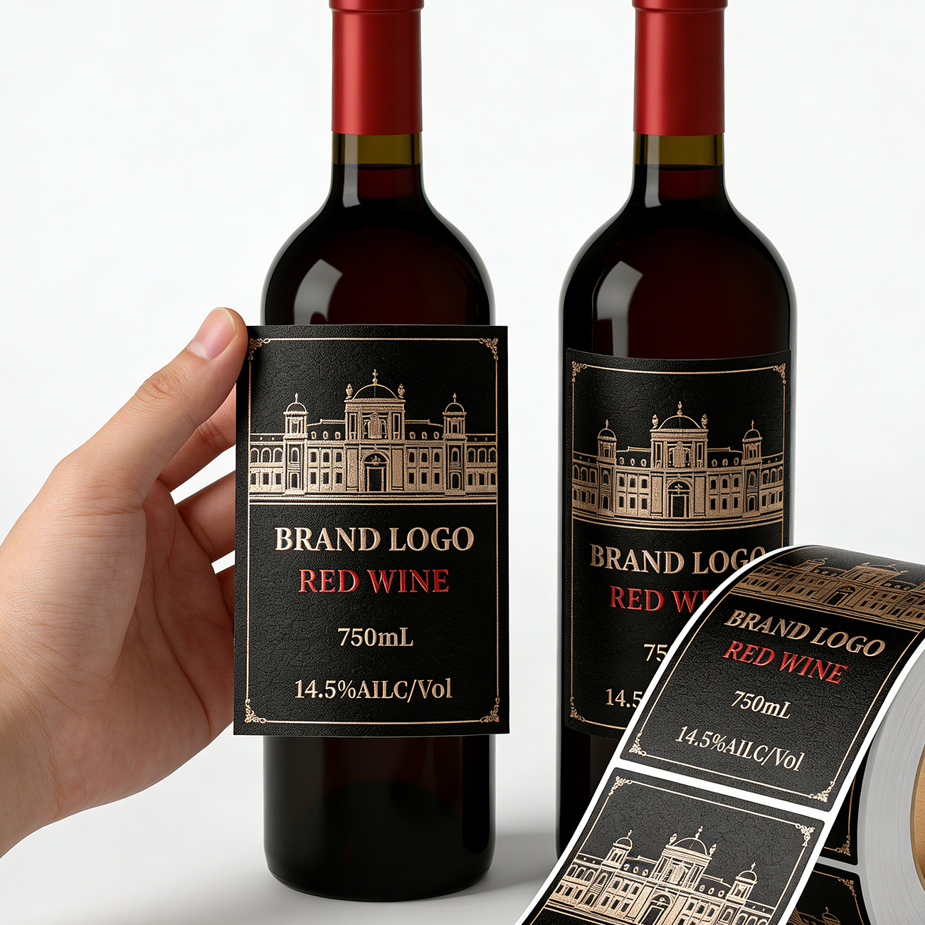
When a consumer recognizes your bottle label from previous purchases, they experience an immediate sense of trust and familiarity that accelerates the purchase decision. A cohesive bottle label design system across your product range reinforces brand identity and makes future product launches feel like natural extensions of an established brand. Inconsistent bottle label design across your product portfolio confuses consumers and dilutes brand recognition, forcing shoppers to spend extra mental effort identifying whether products are from the same manufacturer. Strategic bottle label consistency creates a visual signature that becomes synonymous with your brand promise and quality level in the minds of repeat customers.
Quality Signals Through Design
Consumers use bottle label appearance as a proxy for overall product quality, a psychological phenomenon known as the halo effect. A premium bottle label with professional design, high-quality materials, and careful finish execution signals that the manufacturer invests in excellence throughout the product. Conversely, a poorly executed bottle label with smudged printing, cheap materials, or amateur design suggests lower quality regardless of actual product merit. The bottle label essentially communicates your brand's commitment to consumer satisfaction and product integrity, influencing perception before consumers taste or use the product.
Strategic Information Hierarchy and Decision Influence
Communicating Product Benefits
A bottle label must strategically position key product benefits where consumer eyes naturally travel first, typically the upper portion of the label. Information about organic certification, sustainability practices, or specialized ingredients on your bottle label can justify premium pricing and attract value-conscious consumers. The bottle label serves as an educational tool that differentiates your product in crowded categories where base products are functionally similar. By using the bottle label to highlight unique attributes, certifications, or sourcing stories, you guide consumers toward understanding why your product justifies shelf space and budget allocation.
Trust Markers and Certifications
Regulatory compliance logos, certification badges, and trust markers on a bottle label reassure consumers and reduce purchase hesitation. A bottle label prominently displaying food safety certifications, organic credentials, or fair trade symbols addresses consumer concerns about product integrity and ethical sourcing. These visual cues on your bottle label act as third-party validation, particularly important for consumers purchasing unfamiliar brands or products in premium categories. The strategic placement of trust markers on your bottle label demonstrates transparency and commitment to standards, building confidence in purchasing decisions.
Material Selection and Tactile Experience
Label Materials and Finish Options
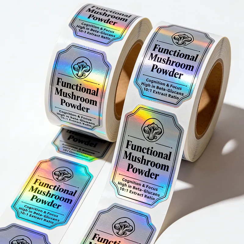
The physical quality of a bottle label contributes significantly to perceived product value and retail shelf appeal. Waterproof materials, premium finishes like matte or metallic effects, and special coating applications elevate a bottle label from functional necessity to luxury communication device. A bottle label that resists moisture, maintains color vibrancy, and feels substantial to touch creates a premium tactile experience that influences consumer perception of product quality. Material choices for your bottle label communicate attention to detail and respect for the consumer experience, factors that justify price premiums and foster brand loyalty.
Durability and Shelf Performance
A bottle label must withstand retail handling, temperature fluctuations, moisture exposure, and time without deterioration that undermines visual appeal. When a bottle label becomes wrinkled, faded, or damaged on the shelf, it signals poor quality regardless of actual product merit. Durable bottle label materials and adhesives ensure that your product maintains premium appearance throughout its entire shelf life and consumer journey. Investing in high-quality bottle label production protects your brand reputation and ensures that retail shelf presentation remains competitive and appealing to consumers throughout the product's selling period.
FAQ
Why is bottle label design more important than product packaging shape?
While bottle shape contributes to shelf appeal, the bottle label is where most visual communication happens because it carries color, imagery, brand narrative, and key messages. Consumers spend significantly more mental energy processing label information than bottle geometry, making label design the primary driver of shelf impact and purchase decisions. A standard bottle with exceptional label design outperforms a unique bottle shape with mediocre label design in competitive retail environments where shelf space is limited and consumer attention is fragmented.
How often should a bottle label design be refreshed?
A bottle label should be refreshed when market trends shift, consumer preferences evolve, or competitive landscape changes materially, typically every 3 to 5 years. Rather than radical redesign that confuses loyal customers, incremental bottle label updates maintain brand recognition while signaling contemporary relevance and product innovation. Monitor consumer feedback, retail performance data, and competitive activity to determine when your bottle label requires modernization to maintain market competitiveness and consumer appeal.
Can a bottle label be designed to appeal to multiple consumer segments?
Strategic bottle label design can incorporate visual and informational elements that resonate with different consumer segments by using color, imagery, and messaging hierarchy that appeals to primary audiences while remaining relevant to secondary segments. bottle label customization allows brands to balance premium positioning with accessibility, sustainability credentials with functionality, and heritage narratives with modern appeal. However, attempting to serve too many competing segments dilutes bottle label impact, so brands must prioritize core audience resonance while creating secondary appeal layers.